Following are some tips for preparing posters for scientific conferences.
How long does it take to prepare a poster?
It is always best to allow for as much time as possible to complete your poster. Experience indicates that posters typically take much longer than you expect; sometimes twice or even three times longer. Unlike a talk, where you can tweak your slides almost up until the moment that you present, the poster needs to be finalized before you leave for your meeting. It is recommended not to leave a poster until the last minute.
How Large Should I Make My Poster?
The poster should conform to the size restrictions imposed by the conference organizers while working within AL’s options. Be sure to check with the organizers about the size specifications. A landscape layout is more popular and is usually easier to read.
 UMCES Branding Guidelines
- When inserting logos into a poster with a solid but colored background, use a transparent PNG format whenever possible to avoid appearances like the example shown at right.
- UMCES logo/branding guidelines can be found here: https://www.umces.edu/sites/default/files/UMCES%20Logo%20Guidelines.pdf
- Always be sure to use the currently approved UMCES logo if you elect to include one on your poster. Files in both JPEG (white background) and PNG (transparent background) formats can be downloaded here: https://www.umces.edu/logos-e-letterhead
Tips for Images and Graphics
- The resolution of each image inserted into your poster should be 150-300 dpi (or pixels per inch) at the final printing size. Resolution below 150 dpi will result in a pixelated image. Note that an image that looks good on the computer screen will not necessarily print well.
- The following table can be used as a rough guide to assess the quality of your image or graphics files:
| Image Size | Required Approximate File Size |
|---|---|
| 4x6" | 1.5MB |
| 8x10" | 5MB |
| 8.5x11" | 6MB |
| 12x18" | 14MB |
| 24x36" | 55MB |
- Never copy and paste images, especially into PowerPoint. Use Insert > Pictures (PowerPoint) or File > Place (Adobe) to insert images and graphics.
- Using the SHIFT key when you resize graphics with your mouse will preserve the aspect ratio
- Do not use WordArt in your poster. It is not of adequate quality to look sharp when printed large.
- Provide the source of any image that is not yours. And only use images that are in the public domain. When in doubt, ask the author/photographer/illustrator for permission.
- Keep graphs simple
- Avoid “chart junk”: 3-D, shadowing, multiple grid lines, labeling every tick mark, etc
- With multiple graphs, combine information (e.g. share axis labels, titles, legends)
Selecting Colors
- Use no more than three main colors in your poster, excluding black and white. Too many colors can be distracting.
- Choose background colors to maximize contrast between the text and the background.
- Try to coordinate the colors used in your figures with the colors used in your poster.
- Background images can be impactful but they can also be distracting to readers. If you use a background image, be sure that your text is legible and that you employ solid-colored opaque or semi-transparent background text boxes to minimize distractions. Gradient backgrounds can also be distracting.
- Dark solid backgrounds can sometimes print with noticeable lines. Make sure that your contrast between background and text is adequate.
- Avoid neon colors. They are hard on the eyes and usually don’t print in the same hue as they are seen on screen.
- White text on a dark background works better for screens/slides, but not for printed materials like a poster.
 Selecting Fonts
- Serif vs. sans-serif – The font you choose for telling your story is almost as important as the story itself. Most fonts in books, journals, and newspapers are serif fonts (i.e., the letters feature small lines at the ends of strokes), while most screen/online content uses sans-serif fonts. Serif fonts can help guide the reader’s eye along lines of text, and certainly have a use in poster design, but serifs can also clutter text. Generally, sans-serif fonts are best in graphic design, and widely available examples such as Arial, Calibri, Helvetica, Verdana, and Tahoma can dramatically enhance the legibility of a poster over, say, Times New Roman or Garamond.
- Select font colors to maximize contrast.
- Be consistent with your fonts. Never use more than two different fonts in your poster. It is recommended to use a sans-serif font (e.g., Helvetica) for the title and headings and a serif font (e.g., Palatino) for body text. Serif-style fonts are much easier to read at smaller font sizes.
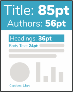 Choose a font size and style that can be easily read from several feet away. Recommended size ranges for fonts:
- Title: 45 – 120 pt font, depending on title length. It’s OK to write titles in Bold
- Headings, Authors/Institution: 30 – 60 pt font, depending on space
- Body text: 18 – 30 pt font
- To emphasize a point, use bold or italics rather than underlining.
- All fonts that come with your operating system will embed in your poster file. However, if you are using a special font that you downloaded from the internet, you need to ensure that it will embed in your file. If you are not sure if your font has embedded, open the file on a computer that does not have the special font installed. If the image viewer has replaced the font with something else, it means the special font was not embedded in your file and your printed poster will not look the same.
- Let text wrap in the text box. If you use hard returns and need to resize your text box later, you will have to fix the returns.
- Preview your poster at 100% to make sure that your text boxes and images don’t overlap (which can cause printing problems).
What if I need to resize my poster?
Keep in mind that it’s usually impossible to make your poster significantly larger in size and still look professional unless you are working with a vector-based program, like Illustrator or InDesign. It is best to plan ahead and start with the correct size before you start inserting figures and images to your poster. If you try to upscale them, they will appear pixelated and grainy and you may have to recreate your poster from scratch at the larger dimensions.
Will the poster fill the entire page?
Print shops refer to an image filling the entire page/print surface as full page bleed. That service is not available at AL. Your poster will have a thin white margin on all four sides, which we try to minimize as much as possible. You may elect to trim those white edges from the poster yourself if you choose.
Designing for Deuteranopes
People tend to use red, green, and blue on white backgrounds, because those are simple colors that are dark enough to stand out. But that can be a problem for deuteranopes.
Deuteranopia is one form of colour blindness. About 7-8% of men are color blind in one way or another, with red-green color blindness of some form being the most common. Thus, chances are that at a reasonably sized conference, someone walking past your poster could have issues distinguishing colors that most of us take for granted. In general, avoid using red and green together, and opt to use symbols and line patterns (e.g., dashed vs. solid, open vs. solid) instead of colors to distinguish between graph elements. You can also run your images or graphs through a color checker before inserting them into your poster. Adobe Photoshop has a color-blind simulator and there are some online applications, like: https://www.color-blindness.com/coblis-color-blindness-simulator/.
General Guidelines
- Arrange your material in a logical progression and use columns or some other design scheme to help create this progression.
- The number one mistake is to make a poster too wordy. Aim for 1000 words or less. That might mean 700 words in paragraph form (body text), plus 300 words in the legends of all your figures and tables.
- Don’t try to cram too much onto your poster, sacrificing legibility and visual flow. Give your content “breathing room”. A cramped poster is hard to read, and the brain simply cannot effectively process the information provided, regardless of how amazing it is.
- Size your poster file correctly BEFORE you start adding any content.
- Whenever possible, use lists of sentences, or bullet points, rather than large blocks of text.
- Make sure that details on graphs and photographs can be comfortably viewed from 6 feet away. A common mistake is to assume that axes labels, figure legends, and numbers on axes are somehow exempt from font-size guidelines. The truth is that the majority of viewers want to read only your figures.
- If you have trouble understanding the difference between “effect” and “affect,” it’s probably best to avoid using those words.
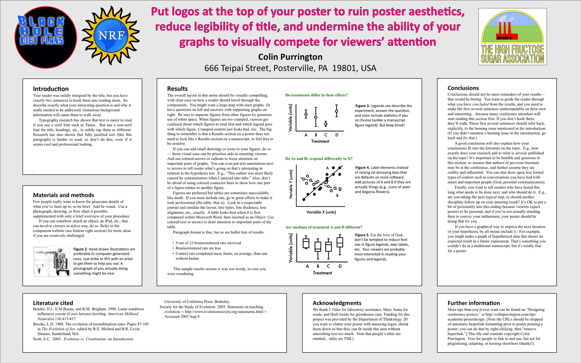
- Try not to clutter the top of your poster with logos. If you are required by your mentor or collaborators to include logos on your poster, put them on the bottom of the poster and make them small. Here is an example image of a poster with logos at the top if you’d like see why it’s a graphical fail.
- Fresh eyes are helpful. Save time and costs for re-prints by allowing sufficient time for review by peers, your advisor, or your co-author(s). Take advantage of the large monitors in the Administrative Conference Room or the Library to view your poster close to its printed size.
PowerPoint Templates
There are a number of sources for templates that can save you a significant amount of preparation time that have been constructed with appropriate font sizes and harmonious color schemes:
- https://www.makesigns.com/SciPosters_Templates.aspx
- PowerPoint Poster Templates
- https://phdposters.com/templates
- https://postersmith.com/poster
- https://www.genigraphics.com/templates
Poster Repositories for Inspiration
Helpful Links
- https://libguides.usc.edu/healthsciences/posters
- https://projects.ncsu.edu/project/posters/index.html
- https://www.kmeverson.org/academic-poster-design.html
- https://ugs.utexas.edu/our/poster
- https://betterposters.blogspot.com/2011/04/using-grids-in-powerpoint.html
- https://blogs.nicholas.duke.edu/fuelforthought/how-to-print-your-conference-poster/
- https://www.mc.vanderbilt.edu/documents/evidencebasedpractice/files/Step%20by%20Step-Poster%20making%20tips.pdf